

Those of us who’ve played baseball know the strike zone is across the plate and from the letters on your jersey to your knees. Major League Baseball is more specific.
The official strike zone is the area over home plate f rom the midpoint between a batter’s shoulders and the top of the uniform pants — when the batter is in his stance and prepared to swing at a pitched ball — and a point just below the kneecap. In order to get a strike call, part of the ball must cross over part of home plate while in the aforementioned area.
— MLB Strike Zone
Now, this would not be a big deal until the advent of the strike zone graphic at the bottom right of most baseball telecasts today. After an important ball or strike, the affected bench coaches can go ballistic over a call that appears above or below the strike zone based on what they saw on the televised strike zone graphic.
Here’s the problem: most of those televised strike zones are inaccurate because they use only one graphic even though players are of a variety of heights; differing measurements NOT reflected by the on-screen graphic.
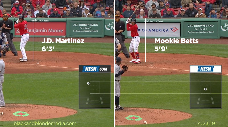
As in the graphic above, you have two players separated by six inches of height, yet the on-screen graphic is uniform.
This is a relatively easy fix. It’s just a question how motivated the Chyron operators who call up the graphics in the broadcast truck are. As there are separate lower third graphics for each player, updated per at bat that displays their current batting average, a player-specific strike zone could be called up as well.
We ARE talking some extra work but we may see fewer frustrated fans, coaches and players when balls and strikes may or may not be called accurately and the only visual that is referred to is highly flawed.